SNEAKZ
Branding & Packaging Design

Project Overview
This project entailed designing branding for a fictional sports shoe company called SNEAKZ, and designing & mocking up a shoebox. The goal of this 2 part project was to be able to deliver assets that would speak to the young target demographic of the brand.
Tools Utilised
- Adobe Photoshop
- Blender
Process — Branding
I wanted to evoke a sense of familiarity with the logo design, leaning on strong geometric shapes largely drawn from the consonants in the brand's name 'SNKZ'. This was accented by a ball, formed with a circle sporting a simple curved line detail. This would speak to the brand's core product, and lift the logo upwards.
Branding was rounded out with 4 core colours: a bright turquoise, purple, and orange-yellow, and a darker blue-green for contrast. This palette was chosen to bring energy to the brand, and speak to the young demographic.
Process — Packaging Design & Mockup

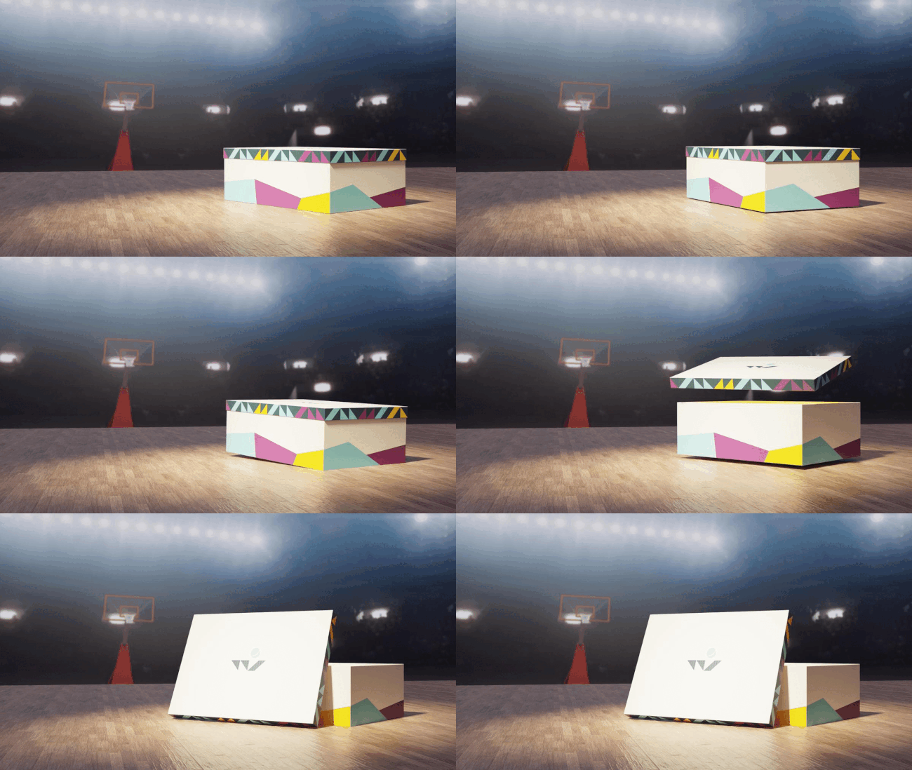
The shoebox design is anchored in geometric shapes that echo the branding. The box itself features a ring of odd-shaped polygons, encircling the bottom of the box to give it energy and suggest movement. The box is accented by the design that runs around the edge of the lid. This enforces the boldness of the brand, utilising the strong contrast offered by the logo's geometric shapes organised on the dark blue-green background.
The design was mocked up on a simple shoebox modelled in Blender, and set in a basketball court with a simple animation as the foundation for marketing purposes.
Takeaways
Key to this project was the understanding that the needs of the brand should always remain at the centre of all design decision. Though this may appear to present as a challenge, it is what makes the design process most fulfilling to me, and makes gives direction to the creative process.


